Back to examples
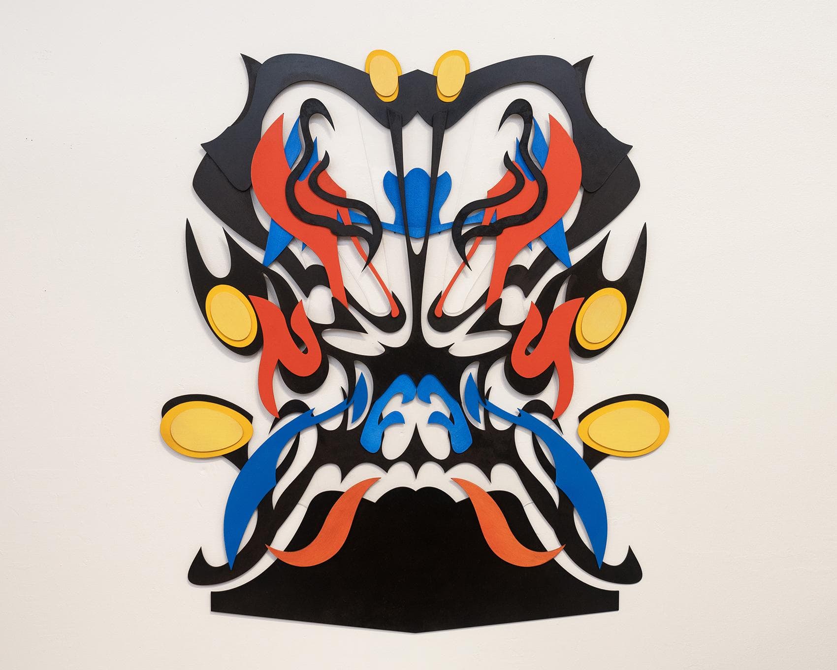
Artwork titled Gaze by David Luo

Gaze

David Luo
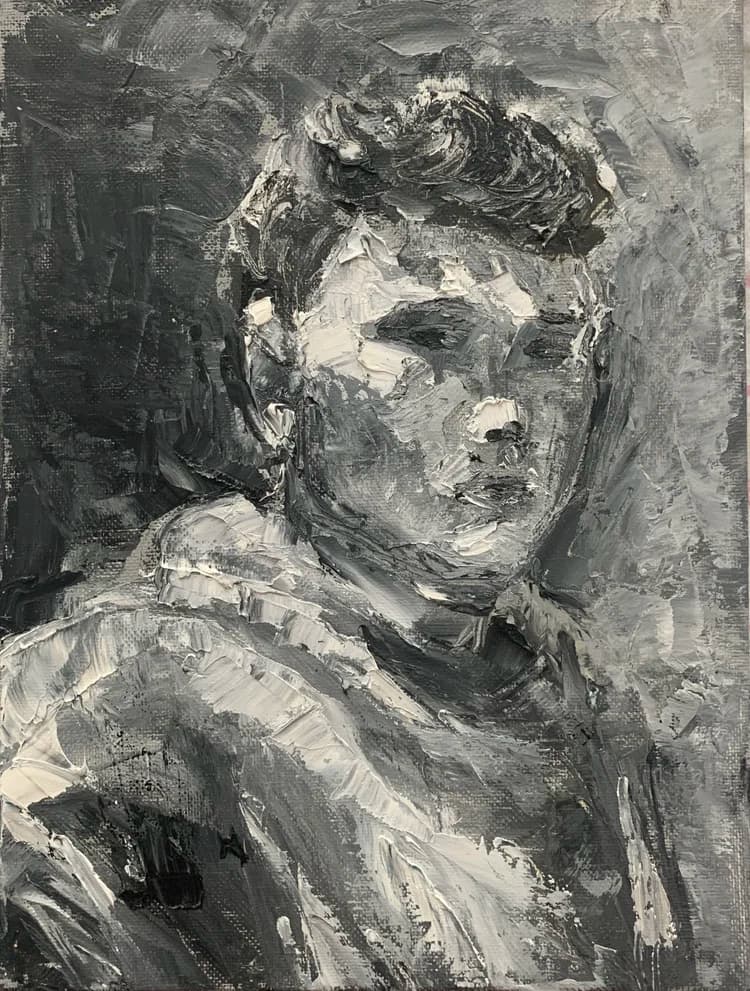
Portrait painting of Yixiang David Luo in gray tones

David Luo

Yixiang Luo is a Chicago-based artist with an MFA from the School of the Art Institute of Chicago. His recent works explore the intersection between physical urban landscapes and digital, sci-fi realms, with exhibitions at Bruno David Gallery, SAIC Art Gallery, Des Lee Gallery, Granite City Art and Design District, Monaco Art Gallery, and Graduates Art Fair in Shenzhen, China.

01 / Lens result

Visual Reading

Composition and Symmetry

The artwork presents a strong bilateral symmetry, with forms mirrored across a central vertical axis. This creates a mask-like or heraldic quality. The overall silhouette is roughly rectangular, widening slightly towards the top and bottom, with a central constriction. The arrangement of shapes suggests a stylized face or crest, reinforced by the placement of yellow ovals that read as eyes or decorative elements.

Color Relationships

The palette is limited to black, red, blue, and yellow. Black dominates as the foundational layer, providing strong contrast. Red and blue elements are interspersed, often in curvilinear, flame-like or tendril forms. Yellow is used sparingly, primarily for circular or oval accents, drawing attention to specific points within the composition. The colors are flat, without gradients or shading, contributing to a graphic aesthetic.

Line Quality and Form

The lines are sharp and precise, indicating cut forms rather than drawn ones. There is a consistent use of organic, flowing curves alongside pointed, angular protrusions. These contrasting line qualities create a dynamic tension; the smooth curves suggest movement, while the sharp points add an aggressive or energetic edge. The shapes are distinct and layered, creating shallow relief.

Spatial Organization and Layering

The artwork is constructed from multiple layers of cut material, creating a shallow three-dimensional effect. The black forms generally serve as the base, with red, blue, and yellow elements layered on top. This layering creates subtle shadows, particularly visible where the yellow ovals are slightly elevated, adding depth to the otherwise flat color fields. The white background acts as negative space, defining the intricate contours of the assembled forms.

Rhythm and Repetition

Repetition of specific shapes and motifs is evident, particularly the flame-like red and blue elements and the pointed black forms. This repetition, combined with the bilateral symmetry, establishes a strong visual rhythm that guides the eye across the composition. The variation in size and slight alteration of these repeated forms prevents monotony and adds complexity to the overall pattern.

02 / Lens result

Thesis Discovery

Deconstructed Iconography and the Rorschach Effect

Evidence: The composition utilizes a strict bilateral symmetry with interlocking, flame-like silhouettes in primary red, blue, and yellow against a dominant black framework. The negative space creates white voids that suggest facial features—eyes, a nose bridge, and a brow—without fully resolving into a figurative portrait.

Interpretation: The work functions as a psychological mirror, using the language of traditional mask-making or operatic face paint but stripping away the narrative context. By hovering between a recognizable face and a collection of abstract shards, it invites the viewer to project identity onto a hollow structure, suggesting that cultural or personal personas are often fragile assemblages rather than solid entities.

The Tension of Flatness and Dimensionality

Evidence: The artwork is composed of layered, flat-colored cutouts that cast subtle shadows onto the white wall behind them. The edges are sharp and mechanical, yet the overall silhouette is organic and fluid, mimicking the curves of smoke or musculature.

Interpretation: There is a productive conflict between the graphic, almost digital precision of the shapes and their physical presence as layered objects. This material choice may suggest a transition from the ephemeral (like a digital icon or a memory) into the physical world. The shadows transform the 'flat' image into a low-relief sculpture, implying that even the most two-dimensional symbols possess a hidden weight and spatial consequence.

Aggressive Ornamentation and Defensive Posturing

Evidence: The forms are characterized by sharp, hook-like terminals and outward-pointing spikes. The color palette is high-contrast, with saturated pigments contained within thick black outlines, and the central base is a solid, heavy black trapezoid.

Interpretation: The visual language communicates a sense of defensive aggression or ceremonial power. The sharp points and 'armored' appearance of the layers suggest a protective shell. This could be read as a metaphor for the way individuals or cultures utilize elaborate displays—costume, ritual, or digital branding—as a means of both self-assertion and self-preservation against external scrutiny.

03 / Lens result

Constructive Argument

Repetitive Formal Language

Critique perspective: Formal

Observation: The artwork relies heavily on bilateral symmetry and a limited vocabulary of curved, flame-like, and teardrop shapes across its composition. These forms are repeated both within the larger black silhouette and in the smaller, brightly colored cutouts.

Critical analysis: While symmetry can provide visual balance, its pervasive use here, combined with the consistent repetition of a few specific motifs, risks making the composition feel static or predictable. The forms, though dynamic individually, do not always build into a more complex or surprising visual narrative when mirrored and reiterated. This can lead to a decorative quality rather than a sense of active tension or evolving visual interest.

Question for the Artist: How might breaking or subtly disrupting the strict bilateral symmetry, or introducing a wider range of formal gestures, activate the composition and prevent the repeated motifs from becoming merely ornamental?

Materiality and Depth

Critique perspective: Material

Observation: The layered paper cutouts create a shallow relief, with some elements slightly raised from the background. The edges of the paper are visible, and the overall impression is one of flatness despite the layering.

Critical analysis: The current material approach, while clean, does not fully exploit the potential for depth or textural variation that layering can offer. The uniform thickness and smooth surfaces of the paper, combined with the stark color contrasts, emphasize the graphic quality. This might limit the work's ability to engage the viewer through more subtle material interactions or to suggest spatial complexity beyond a simple foreground/background relationship. The material choice appears to serve primarily as a vehicle for form and color, rather than contributing its own distinct expressive qualities.

Question for the Artist: Could varying the thickness, texture, or even the type of paper introduce a more tactile or spatially ambiguous quality to the work, moving beyond its current graphic emphasis?

Color Palette and Visual Hierarchy

Critique perspective: Compositional

Observation: The artwork uses a high-contrast palette of black, red, blue, and yellow. These colors are distributed in distinct, often isolated, sections within the larger black form. The yellow elements, in particular, function as discrete, eye-like or jewel-like accents.

Critical analysis: The strong, unmodulated colors create a vibrant but somewhat fragmented visual experience. Each color tends to assert its presence equally, which can flatten the overall composition and make it difficult for the eye to establish a clear hierarchy or a dynamic path through the work. The yellow elements, while drawing attention, do not always integrate fluidly with the surrounding red and blue forms, sometimes appearing as applied embellishments rather than integral parts of a unified structure. This can lead to a lack of sustained visual flow or a clear focal point beyond the initial impact of the bright colors.

Question for the Artist: How might a more nuanced approach to color, perhaps through subtle gradients, overlaps, or a more deliberate distribution of intensity, guide the viewer's eye more effectively and create a stronger sense of visual depth or narrative?

04 / Lens result

Relevant References

Henri Matisse

Type: Artist

Relationship Strength: ★★★

Why It Relates: Matisse's late period cut-outs demonstrate a similar approach to form, color, and composition, where shapes are cut from pre-colored paper and arranged to create dynamic, often large-scale, works. The layering and graphic quality are strongly reminiscent.

Specific Visual or Conceptual Link: The use of flat, unmodulated colors (red, blue, yellow, black) against a neutral background, and the construction of complex forms through layered, cut-paper elements. The organic, curvilinear shapes in the artwork echo Matisse's botanical or figural abstractions.

Source / Citation: Matisse, Henri. 'The Cut-Outs.' MoMA, 2014.

Symmetry in Art and Design

Type: Art Historical Concept

Relationship Strength: ★★★

Why It Relates: The artwork employs bilateral symmetry as a fundamental organizing principle, creating a balanced and often confrontational or iconic presence. This formal device has been used across cultures and periods to evoke stability, divinity, or a sense of the monumental.

Specific Visual or Conceptual Link: The precise mirroring of shapes and colors along a central vertical axis. This symmetry contributes to the mask-like or heraldic quality of the composition, suggesting a face or emblem.

Source / Citation: Weyl, Hermann. 'Symmetry.' Princeton University Press, 1952.

Op Art

Type: Art Movement

Relationship Strength: ★★☆

Why It Relates: While not strictly Op Art, the precise layering and contrasting colors create a sense of visual vibration and depth that can be associated with Op Art's exploration of optical illusions and perceptual effects. The sharp edges and graphic quality contribute to this.

Specific Visual or Conceptual Link: The interplay between the black, red, and blue shapes against the white background creates an optical flicker, particularly where the colors meet or overlap. The negative space also plays an active role in defining forms, a characteristic often found in Op Art.

Source / Citation: Barrett, Cyril. 'Op Art.' Studio Vista, 1970.

African Masks and Tribal Art

Type: Artistic Influence / Cultural Reference

Relationship Strength: ★★☆

Why It Relates: The overall configuration of the artwork, with its symmetrical arrangement and prominent 'eyes' and 'mouth' forms, strongly evokes the aesthetic of ceremonial masks. The stylized, abstract representation of facial features is a common element in various African tribal arts.

Specific Visual or Conceptual Link: The central symmetry, the bold, graphic shapes, and the suggestion of a face or totemic figure. The yellow ovals function as prominent eyes, and the lower black shape suggests a jawline or mouth, reminiscent of the abstracted human or animal forms in masks.

Source / Citation: Fagg, William. 'African Tribal Images: The Katherine White Reswick Collection.' Cleveland Museum of Art, 1968.

05 / Lens result

Artist Statement

Settings
Perspective
First person
Tone
Professional

My work explores the interplay of symmetry and organic form through layered cut paper. In this piece, I construct a central, mask-like configuration using a restricted palette of black, red, blue, and yellow. The dominant black forms establish a foundational silhouette, from which vibrant red and blue elements emerge, suggesting a dynamic, almost flame-like energy. The yellow circular and oval shapes, strategically placed, function as focal points, drawing the eye across the composition. The layering of these distinct shapes creates a visual depth, where positive and negative spaces are equally active, contributing to an overall sense of controlled tension and visual rhythm. The precision of the cuts and the deliberate arrangement of each component are central to how I articulate these formal relationships.