Back to examples
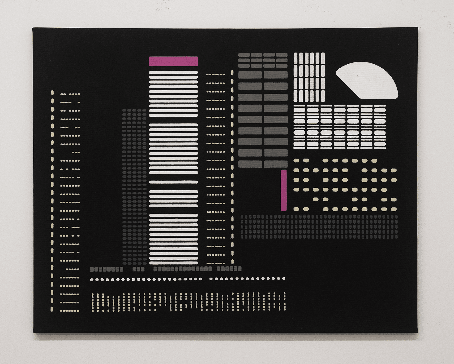
Artwork titled Living Index by David Luo

Living Index

David Luo
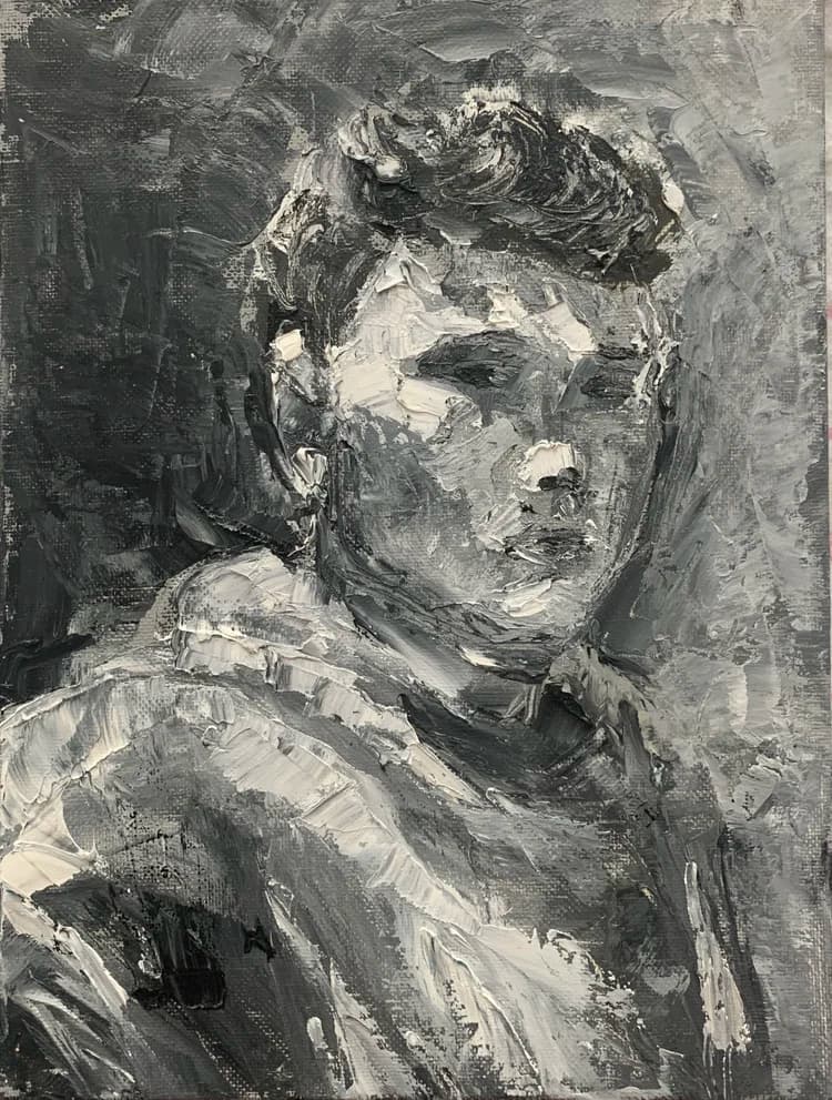
Portrait painting of Yixiang David Luo in gray tones

David Luo

Yixiang Luo is a Chicago-based artist with an MFA from the School of the Art Institute of Chicago. His recent works explore the intersection between physical urban landscapes and digital, sci-fi realms, with exhibitions at Bruno David Gallery, SAIC Art Gallery, Des Lee Gallery, Granite City Art and Design District, Monaco Art Gallery, and Graduates Art Fair in Shenzhen, China.

01 / Lens result

Visual Reading

Composition

The composition is organized into a grid-like structure, predominantly horizontal and vertical, with various rectangular and circular elements. The elements are arranged in distinct blocks, suggesting a modular system. There is a clear division between the left and right halves of the canvas, with the left side featuring more elongated vertical elements and the right side presenting a denser arrangement of smaller, more varied shapes. The overall impression is one of structured data or an abstracted urban landscape.

Color and Tone

The artwork employs a limited color palette dominated by black as the background. Against this, white, light beige, various shades of gray, and a single accent of magenta are used. The white and light beige elements appear to glow against the dark background, while the grays recede. The magenta provides a distinct, albeit small, focal point due to its saturation and contrast with the otherwise neutral tones.

Geometric Forms and Repetition

The piece is constructed almost entirely from geometric forms: rectangles, squares, and circles. These forms are repeated extensively, particularly in rows and columns, creating patterns of dots and lines. This repetition suggests a system or code, where individual units combine to form larger, more complex structures. The variation in size and spacing of these repeated forms introduces a rhythmic quality.

Density and Emptiness

There is a clear interplay between dense clusters of elements and areas of relative emptiness. The black background functions as negative space, allowing the colored forms to stand out. Some sections are packed with small, repeated units, creating a sense of visual weight, while other areas, particularly towards the top right, feature larger, more isolated shapes that provide visual breathing room. This contrast contributes to the overall rhythm of the composition.

Spatial Organization

The spatial organization is flat, with no discernible depth cues beyond the slight optical illusion created by the contrast between light and dark elements. The forms appear to sit directly on the surface of the black canvas, reinforcing the graphic and two-dimensional nature of the image. The arrangement of elements suggests a horizontal stratification in some areas and vertical stacking in others, without creating a traditional perspectival space.

02 / Lens result

Thesis Discovery

The Architecture of Data and Digital Urbanism

Evidence: The composition uses a strict grid of repeating geometric units—rectangles, dots, and pill shapes—arranged in vertical and horizontal clusters. The high-contrast palette of white, grey, and magenta against a flat black background mimics the aesthetic of early computer interfaces or punch cards.

Interpretation: The work visually translates the physical density of a cityscape into the logic of information systems. By reducing complex forms to modular, binary-like components, the image suggests that the modern environment is constructed as much from data and code as it is from steel and glass, highlighting a shift from tactile reality to a digitized, schematic existence.

Chromatic Disruption and Systemic Anomalies

Evidence: While the majority of the work adheres to a monochromatic scale of white and grey, two distinct blocks of saturated magenta are placed within the central and right-hand clusters. These blocks break the established rhythm of the surrounding patterns.

Interpretation: The magenta elements function as 'glitches' or intentional deviations within a rigid system. They may represent the human element, a localized error, or a specific point of focus within an otherwise automated or repetitive landscape. This tension suggests that even within highly controlled, algorithmic structures, there remains a capacity for singular, unassimilated events.

Compression and the Loss of Depth

Evidence: The painting utilizes a completely flat black ground with no atmospheric perspective or overlapping that suggests three-dimensional space. The 'buildings' or 'data blocks' are rendered as two-dimensional diagrams, and the white semi-circle in the upper right sits flush against the surface.

Interpretation: The total absence of depth suggests a collapse of physical space into a surface-level representation. This flatness can be read as a critique of how digital screens and maps flatten our experience of the world, replacing the physical navigation of space with the scanning of icons and symbols, thereby distancing the viewer from the material reality of the subject.

03 / Lens result

Constructive Argument

Visual Hierarchy and Readability

Critique perspective: Compositional

Observation: The artwork presents a dense arrangement of geometric forms, primarily composed of lines and dots in varying shades of grey, white, and a single accent of magenta. The elements are distributed across the black canvas without a clear focal point or dominant visual pathway, appearing as a fragmented data display or a complex circuit board.

Critical analysis: The current compositional strategy, while suggesting complexity, risks visual fatigue. The lack of a clear hierarchy or intentional visual breaks means the eye struggles to find a resting place or a starting point for interpretation. This undifferentiated density may prevent the viewer from engaging with specific patterns or relationships between forms, potentially reducing the work to a decorative pattern rather than an active visual statement.

Question for the Artist: How might you introduce more deliberate visual hierarchy or points of emphasis within this intricate system to guide the viewer's gaze and deepen their engagement with the work's internal logic?

Materiality and Surface Engagement

Critique perspective: Material

Observation: The image appears to be a flat, painted surface with crisp edges and uniform color application. The forms are rendered with precision, suggesting a controlled, almost mechanical execution. There is little visible texture or gestural quality to the paint application.

Critical analysis: The flatness and uniformity of the painted surface, while consistent with the geometric abstraction, might limit the work's material presence. The absence of tactile qualities or variations in surface tension could prevent a more embodied interaction with the piece. This approach risks reducing the work to a purely optical experience, potentially overlooking opportunities for the material itself to contribute to the conceptual weight or emotional resonance.

Question for the Artist: Could exploring different paint applications, textures, or even alternative materials introduce a more dynamic material dialogue that enhances the work's conceptual underpinnings, or is the current flatness an essential part of the message?

The Role of Color in a Monochromatic Field

Critique perspective: Formal

Observation: The artwork predominantly uses a monochromatic palette of black, various greys, and white. A single, distinct magenta rectangle appears in the upper left quadrant and a thin magenta line is located in the lower right, acting as isolated accents within the overall composition.

Critical analysis: The sparse and isolated application of magenta, while providing a stark contrast, currently functions more as a decorative highlight than a fully integrated chromatic element. Its limited presence raises questions about its specific role: is it a marker, a glitch, an anomaly, or a purely aesthetic choice? Without further development or contextualization within the visual language, these magenta elements risk feeling somewhat arbitrary or underutilized, potentially weakening their capacity to contribute meaningfully to the work's overall narrative or formal tension.

Question for the Artist: What specific function does the magenta serve within this otherwise restrained palette, and how might its deployment be further developed to amplify its significance beyond mere accentuation?

04 / Lens result

Relevant References

Sol LeWitt

Type: Artist

Relationship Strength: ★★★

Why It Relates: LeWitt's systematic approach to art-making, often involving instructions and predetermined rules, resonates with the highly organized and repetitive visual elements in the artwork. The emphasis on geometric forms and seriality aligns with his conceptual framework.

Specific Visual or Conceptual Link: The grid-like arrangements of dots, lines, and rectangles, particularly the varying densities and patterns, echo LeWitt's wall drawings and modular structures that explore permutations of simple forms. The limited color palette also suggests a focus on structure over expressive gesture.

Source / Citation: Sol LeWitt, 'Paragraphs on Conceptual Art,' Artforum, Vol. 5, No. 10, Summer 1967.

Vera Molnár

Type: Artist

Relationship Strength: ★★★

Why It Relates: Molnár is a pioneer of computer art and algorithmic art, using systematic processes to generate visual compositions. Her work often explores variations within a set of rules, which is evident in the artwork's structured yet diverse patterns.

Specific Visual or Conceptual Link: The artwork's composition, built from repetitive units and variations in their arrangement, density, and color, strongly aligns with Molnár's 'machine imaginaire' approach. The visual language of dots and lines, resembling early digital graphics or data representation, is a direct parallel.

Source / Citation: Vera Molnár, 'Toward an Aesthetic of the Algorithmic,' Leonardo, Vol. 28, No. 4, 1995.

Minimalism

Type: Art Movement

Relationship Strength: ★★☆

Why It Relates: The artwork's reduction of forms to basic geometric shapes, its serial repetition, and its limited color palette align with key tenets of Minimalism, which sought to strip art of expressive content and focus on objective, formal qualities.

Specific Visual or Conceptual Link: The use of industrial-looking patterns, the absence of overt narrative, and the emphasis on the intrinsic properties of the visual elements (dots, lines, rectangles) rather than illusionistic representation, are characteristic of Minimalist aesthetics.

Source / Citation: Richard Wollheim, 'Minimal Art,' Arts Magazine, Vol. 39, No. 10, October 1965.

Information Theory and Data Visualization

Type: Theoretical Concept / Field

Relationship Strength: ★★☆

Why It Relates: The artwork's visual language, composed of discrete units arranged in patterns that suggest codes, sequences, or data streams, can be interpreted through the lens of information theory and early data visualization aesthetics.

Specific Visual or Conceptual Link: The varying densities of dots and lines, the segmented structures, and the overall composition evoke the appearance of punch cards, circuit boards, or digital interfaces, implying a system of encoded information rather than a pictorial scene.

Source / Citation: Claude Shannon, 'A Mathematical Theory of Communication,' Bell System Technical Journal, Vol. 27, No. 3, July 1948.

05 / Lens result

Artist Statement

Settings
Perspective
First person
Tone
Professional

My work explores the visual language of data and digital interfaces, translating complex systems into a precise, planar aesthetic. In this piece, I construct a composition using a limited palette of black, white, gray, and accents of magenta and beige. The arrangement of rectangular and circular forms, varying in size and density, evokes the structured yet fragmented nature of information display. I am interested in how these abstract elements, when organized into columns and rows, can suggest both architectural forms and the binary logic of digital code. The interplay between solid blocks and dotted lines, as well as the singular curved white shape, introduces a subtle disruption within the otherwise grid-like order, inviting contemplation on the balance between system and anomaly in contemporary visual culture.