Back to examples
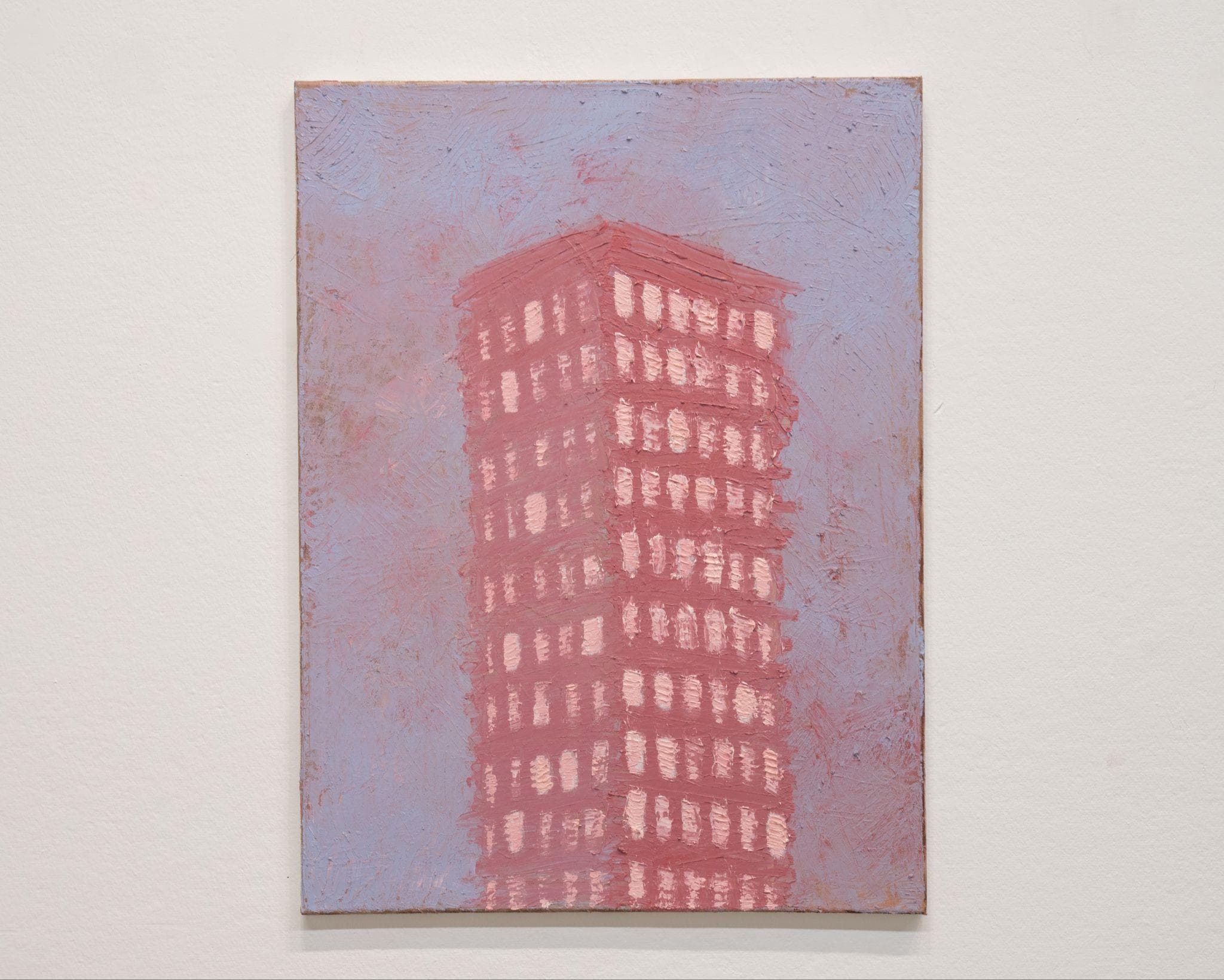
Artwork titled Stacked Lives by David Luo

Stacked Lives

David Luo
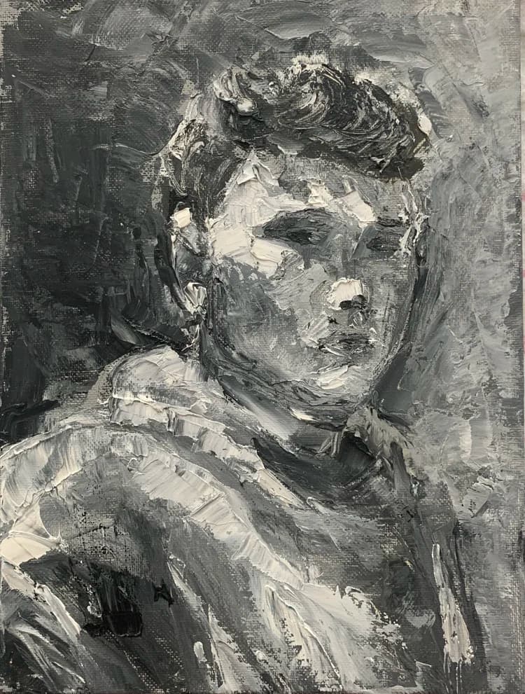
Portrait painting of Yixiang David Luo in gray tones

David Luo

Yixiang Luo is a Chicago-based artist with an MFA from the School of the Art Institute of Chicago. His recent works explore the intersection between physical urban landscapes and digital, sci-fi realms, with exhibitions at Bruno David Gallery, SAIC Art Gallery, Des Lee Gallery, Granite City Art and Design District, Monaco Art Gallery, and Graduates Art Fair in Shenzhen, China.

01 / Lens result

Visual Reading

Color Choice

The painting primarily uses two colors: a muted, dusty rose for the building and a cool, desaturated periwinkle for the sky. The windows are rendered in a lighter, almost off-white pink, creating a subtle contrast against the building's main color. The limited palette contributes to a somewhat melancholic or dreamlike atmosphere, with the colors appearing slightly faded.

Texture and Surface Treatment

The paint is applied with visible brushstrokes, creating a textured surface. This impasto technique is particularly evident in the rendering of the building and the sky, where individual strokes are distinct. The rough texture gives the image a tactile quality, suggesting the materiality of the paint itself.

Composition

The building occupies the central vertical axis of the canvas, dominating the composition. It is depicted from a slightly low vantage point, emphasizing its height. The lack of other elements in the frame, apart from the sky, isolates the structure and draws full attention to its form.

Geometric Forms

The building is a clear geometric form, a rectangular prism, with its edges softened by the painterly application. The windows are also rendered as small, repetitive rectangular shapes. This geometric rigidity is contrasted by the more fluid, less defined brushwork of the sky.

Atmosphere Created by Form

The combination of the isolated, towering building and the muted color palette creates an atmosphere of quiet solitude or perhaps urban detachment. The visible brushstrokes, while adding texture, also contribute to a sense of unpolished reality, rather than a hyper-realistic depiction.

02 / Lens result

Thesis Discovery

The Architecture of Viscosity

Evidence: The building is rendered with thick, impasto brushstrokes that bleed into the surrounding atmosphere. The edges of the structure are not defined by clean lines but by the physical accumulation and dragging of paint, particularly visible where the red pigment meets the muted purple background.

Interpretation: The work suggests a collapse between the permanence of urban architecture and the fluid nature of the medium. By prioritizing the tactile quality of the paint over architectural precision, the building appears less like a stable monument and more like a biological or geological formation, implying that the built environment is subject to the same decay and flux as organic matter.

Isolation and the Monolithic Silhouette

Evidence: A single, vertical structure occupies the center of the frame, isolated from any surrounding context or ground plane. The windows are indicated by repetitive, rhythmic dabs of lighter pigment that lack individual detail, creating a pattern of light that suggests interior life without revealing it.

Interpretation: The central placement and lack of environmental context transform the building into a psychological monolith. The repetitive, anonymous windows may represent the paradox of urban density: a collective existence that remains fundamentally inaccessible and isolating. The structure functions as a vessel for projected solitude, stripped of the functional noise of a city.

Chromatic Tension and Atmospheric Weight

Evidence: The palette is restricted to deep, earthy reds and desaturated, bruised purples. The background is not a void but a heavily worked surface with multidirectional brushwork that carries as much visual weight as the central subject.

Interpretation: The color relationship creates a sense of atmospheric pressure, where the air itself feels as dense as the masonry. This chromatic tension suggests a specific time of day or emotional state—perhaps a twilight that is both literal and metaphorical. The heavy application of paint in the sky prevents the building from 'breathing,' reinforcing a theme of entrapment or the overwhelming presence of the material world.

03 / Lens result

Constructive Argument

Visual Ambiguity of Form

Critique perspective: Formal

Observation: The building form, particularly its upper structure and sides, appears somewhat indistinct. The brushwork, while consistent across the piece, does not always clearly delineate the architectural planes or the relationship between the building and the sky.

Critical analysis: This ambiguity can make it difficult for the viewer to fully grasp the building's three-dimensional presence or its specific architectural character. The choice of a limited, muted palette further contributes to this flattening effect, potentially diminishing the sense of monumental scale or urban presence that a building of this type might convey. The texture of the paint, while expressive, does not consistently serve to articulate form.

Question for the Artist: How might more deliberate variations in brushstroke direction, paint thickness, or subtle tonal shifts be employed to enhance the volumetric clarity of the building without sacrificing the painting's overall textural quality?

Repetitive Mark-Making and Visual Interest

Critique perspective: Compositional

Observation: The small, rectangular marks representing windows are highly repetitive in their form and distribution across the building's facade. While they suggest illumination, their uniformity creates a pattern that is almost decorative rather than structurally integrated.

Critical analysis: This consistent repetition, without significant variation in size, intensity, or arrangement, risks becoming visually monotonous. It may prevent the eye from finding points of specific interest or narrative within the building's structure. The lack of variation might also flatten the sense of depth or perspective, making the facade appear less dynamic than it could be.

Question for the Artist: Could introducing subtle irregularities, variations in light intensity, or strategic omissions in the 'window' marks create a more compelling visual rhythm or suggest a greater sense of life and activity within the structure?

Materiality and Surface Logic

Critique perspective: Material

Observation: The painting exhibits a consistent, relatively thick impasto across both the building and the sky. The edges of the painting show visible raw board or canvas, suggesting an unframed presentation.

Critical analysis: While the impasto provides a tactile quality, its uniform application across all elements can diminish the distinction between different surfaces—building material versus atmospheric space. The visible, unfinished edges of the support, while a valid aesthetic choice, may also detract from the immersive quality of the painted image, pulling attention to the object-ness of the painting rather than the depicted scene. This choice of presentation, if not fully integrated into the conceptual framework, risks appearing as an unresolved element rather than a deliberate formal decision.

Question for the Artist: How does the consistent surface texture and the raw edge presentation actively contribute to the intended reading of this urban landscape, and what might be gained or lost by exploring more varied material applications or presentation methods?

04 / Lens result

Relevant References

Giorgio Morandi

Type: Artist

Relationship Strength: ★★★

Why It Relates: Morandi's still lifes often feature a limited palette and a focus on subtle variations in form and texture, reducing everyday objects to their essential visual information. This painting exhibits a similar restraint in color and a methodical, almost meditative, approach to rendering a singular architectural form.

Specific Visual or Conceptual Link: The muted, almost dusty, color palette of pinks and blues, combined with the visible brushwork that builds up the surface, echoes Morandi's characteristic handling of paint and his exploration of form through tonal shifts rather than sharp contrasts. The building, like Morandi's bottles, is presented as an object for quiet contemplation rather than a dynamic scene.

Source / Citation: Various works by Giorgio Morandi, particularly his still lifes from the mid-20th century.

Philip Guston

Type: Artist

Relationship Strength: ★★☆

Why It Relates: Guston's later figurative work, characterized by a return to representational forms with a distinct, often heavy, impasto and a limited, somewhat 'clumsy' palette, shares a visual sensibility with this painting. The building's simplified form and the thick application of paint suggest a similar rejection of slickness in favor of a more direct, almost raw, expression.

Specific Visual or Conceptual Link: The visible, almost sculptural, brushstrokes and the somewhat blocky, simplified rendering of the building's windows resonate with Guston's distinctive painting style from his 'new figuration' period. The color choices, while different, share a certain unpolished quality.

Source / Citation: Works such as 'The Studio' (1969) or 'City Limits' (1969) by Philip Guston.

Lived-in Architecture / Phenomenological Experience of Space

Type: Architectural Theory / Philosophy

Relationship Strength: ★★☆

Why It Relates: The painting's focus on a single, somewhat isolated building, rendered with a sense of presence and materiality, can be connected to phenomenological approaches to architecture. This perspective emphasizes the subjective experience of built environments, moving beyond purely functional or aesthetic considerations to explore how spaces are inhabited and perceived over time.

Specific Visual or Conceptual Link: The numerous, subtly glowing windows suggest interior lives and activities, implying a building that is not merely a structure but a container for human experience. The slightly worn, textured surface of the paint itself might subtly evoke the passage of time and the 'wear' of a lived-in space, rather than a pristine architectural rendering.

Source / Citation: Gaston Bachelard, 'The Poetics of Space' (1958); Juhani Pallasmaa, 'The Eyes of the Skin: Architecture and the Senses' (1996).

05 / Lens result

Artist Statement

Settings
Perspective
First person
Tone
Professional

My work explores the visual language of urban structures through a reductive lens. In this painting, I focus on a singular high-rise building, rendered in a limited palette of muted rose and lavender. The impasto application of paint, particularly visible in the textured facade and the individual window units, emphasizes the materiality of the surface while simultaneously abstracting the architectural form. The building appears centered and monumental against a subtly variegated sky, suggesting both isolation and a quiet presence within a larger, undefined space. The repetition of rectangular forms for the windows, executed with visible brushstrokes, creates a rhythmic pattern that draws the eye across the surface, inviting a contemplation of structure and surface texture.